5 Visualization
5.1 Outline / cheat sheet
- Plot architecture
ggplot: Create a blank canvas to plot on – this is the foundation of your plotaes: Identify variables in the data frame you’d like to map, including x and y coordinates as well as features like shape, size, color, etc.geom_: Select from various geometries to give shape to your aesthetic mappings,
- Geometries
geom_point: Points for scatter plots, useful for continuous x continuous variablesgeom_smooth: Add trend lines to a plot (especially scatter plots) to detect trends based on a specified estimation
geom_bar: Bar graph for counting up observations of categorical variablesgeom_boxplot: Box plots, useful for distribution of continuous x categoricalgeom_line: Line plot, useful for tracking continuous variables over time
- Styling (automatic and manual)
scale_: Adjust any mapping (e.g.scale_color_,scale_size_) for customization
labs: Add labels to any mappingtheme_: Adjust the overall look of plot (e.g. background, axis lines)
5.2 Plot architecture
ggplot is an incredibly powerful plotting tool that follows the ‘grammar of graphics’ – an approach that supports data visualization according to best practices. A ggplot has a template with three basic parts 1) data, 2) mappings, and 3) geometries, as well as countless other add-ons to enhance the plot. The generic syntax for combining these parts is below:
ggplot(data = <DATA>, mapping = aes(<MAPPINGS>)) + <GEOM_FUNCTION>()We’ll get into the add-ons throughout this lesson, but let’s start by building a plot from the base up. First, let’s input the penguins data into the ggplot function:

What we get is a blank canvas of a plot – ggplot knows you want to plot something, but it isn’t sure what yet because you haven’t given it any specifics about the data. We get into the specifics with mappings, where we give the plot data-based features like x and y coordinates:
Now ggplot knows what you want to plot, and it maps them onto the x and y axes, as we specified. But we still haven’t told ggplot how to map them (i.e. in what shape?). We can specify the shape using one of several geom_ functions. Let’s select a ‘point’ geometry, which we use for a scatter plot of continuous x continuous variables.
## Warning: Removed 2 rows containing missing values or values outside the scale range
## (`geom_point()`).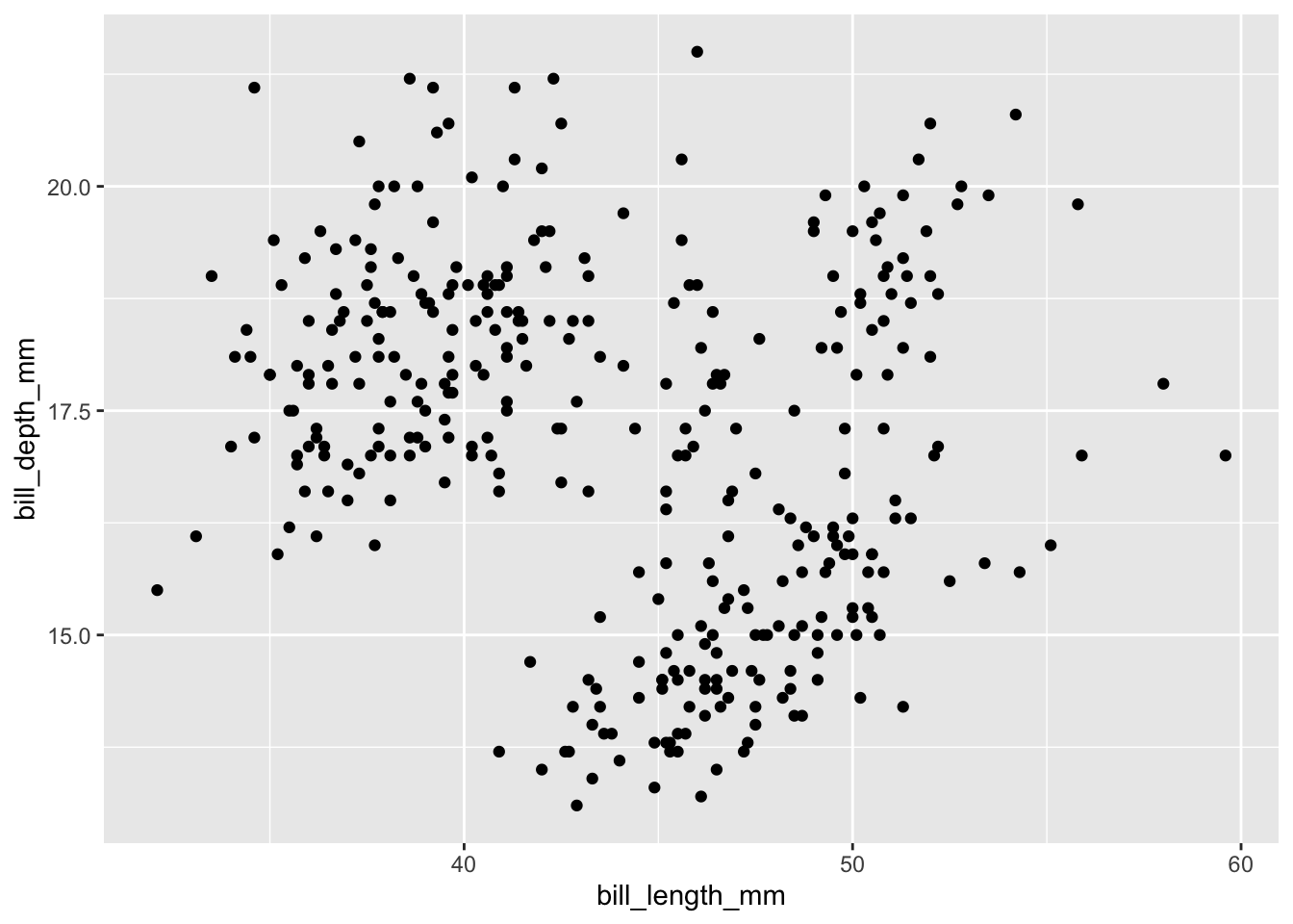
Now we’re getting somewhere. Let’s play around a bit with some additional arguments that you can add to the plot, such as changing the transparency, size, shape, and color. These are all their own arguments that can be placed inside either the ggplot function or the geom function. I prefer to put them in the goem function.
ggplot(data = penguins,
                         aes(x = bill_length_mm,
                             y = bill_depth_mm)) +
  geom_point(alpha = .8, size = 3, shape = 15, color = "darkorange")
## Warning: Removed 2 rows containing missing values or values outside the scale range
## (`geom_point()`).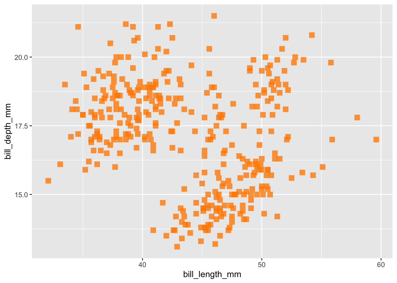
What’s powerful about ggplot is that you can add on multiple layers using the plus sign, and can even add several geometries to one plot. One geometry used for discerning trends is the geom_smooth() geometry, which will assign a trend line based on the distribution you specify, such as “lm”, “glm”, “gam”, or “loess”. Let’s stick with a basic ‘lm’ method, which will create a trend line using the coefficient from the equation lm(y ~ x), which in our case is lm(bill_depth_mm ~ bill_length_mm, data = penguins)
ggplot(data = penguins,
                         aes(x = bill_length_mm,
                             y = bill_depth_mm)) +
  geom_point(alpha = .8, size = 3, shape = 15, color = "darkorange") +
  geom_smooth(method = "lm")
## `geom_smooth()` using formula = 'y ~ x'## Warning: Removed 2 rows containing non-finite outside the scale range
## (`stat_smooth()`).## Warning: Removed 2 rows containing missing values or values outside the scale range
## (`geom_point()`).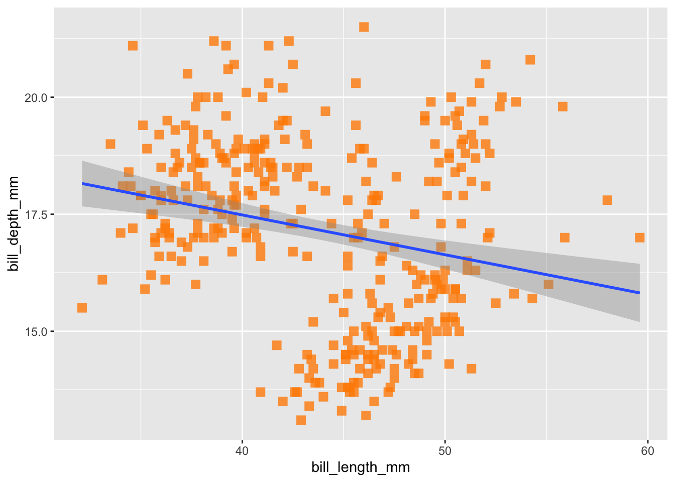
Here we see a slightly negative relationship between bill depth and length, which we can verify by running the same linear model we just passively applied using geom_smooth():
##
## Call:
## lm(formula = bill_depth_mm ~ bill_length_mm, data = penguins)
##
## Coefficients:
##    (Intercept)  bill_length_mm
##       20.88547        -0.08502
But remember, one of the reasons we visualize data is because it can be an incredibly helpful tool for exploratory data analysis, particularly because it gives you the opportunity to ‘get to know’ your data. If you are a penguin expert, you might be surprised by this result: bills tend to grow proportionally, right? And so we’d expect a positive relationship between these two variables. So, what else do we know about our data that might be hiding this relationship? Different penguin species!
Species is an attribute of our data that we want to represent in our current plot, let’s say with color. Previously, we used the color argument to add in a color, and you might want to follow that same pattern now.
ggplot(data = penguins, aes(x = bill_length_mm,
                            y = bill_depth_mm)) +
  geom_point(alpha = .8, size = 3, shape = 15, color = species) +
  geom_smooth(method = "lm", se = FALSE)
However, this approach won’t work because ggplot doesn’t know what “species” is, based on how we’ve input it into the code. We need a way to tell R that “species” is a column inside our penguins data. To do that, we include species as part of our aesthetic mapping, because the aes() function is what cues ggplot to look inside the data for values.
ggplot(data = penguins,
               aes(x = bill_length_mm,
                   y = bill_depth_mm,
                   color = species)) +
  geom_point(alpha = .8, size = 3, shape = 15) +
  geom_smooth(method = "lm", se = FALSE)
## `geom_smooth()` using formula = 'y ~ x'## Warning: Removed 2 rows containing non-finite outside the scale range
## (`stat_smooth()`).## Warning: Removed 2 rows containing missing values or values outside the scale range
## (`geom_point()`).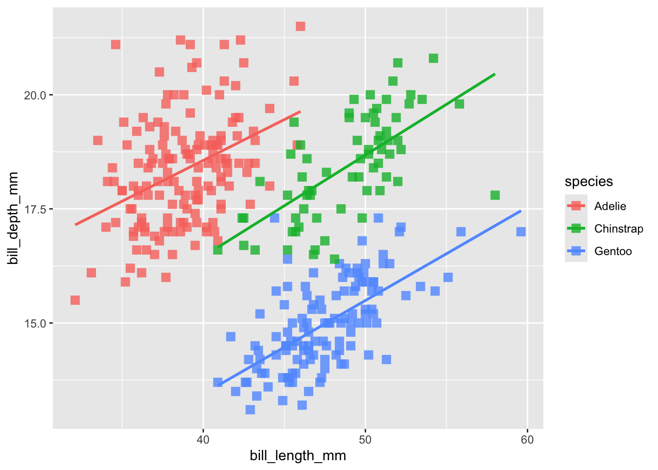
Now its got it! So remember, if you want to add a feature to your plot that is not related to the data (e.g. color = “blue”) it goes outside the aes function. If you want to add a feature to your plot that is related to the data (e.g. color = Species), goes inside the aes function.
Now that we’ve got that straight, let’s draw attention to what happened to our trends: Simpson’s paradox! (i.e. ‘statistical phenomenon where an association between two variables in a population emerges, disappears or reverses when the population is divided into subpopulations’) (Stanford 2021).
5.3 Selecting geometries
Let’s move on to discuss different geometries and when to use them. We’ve already noted that scatter plots with geom_point are a good candidate for continuous x continuous variables. What about when we start working with categorical variables? Let’s review a few different approaches:
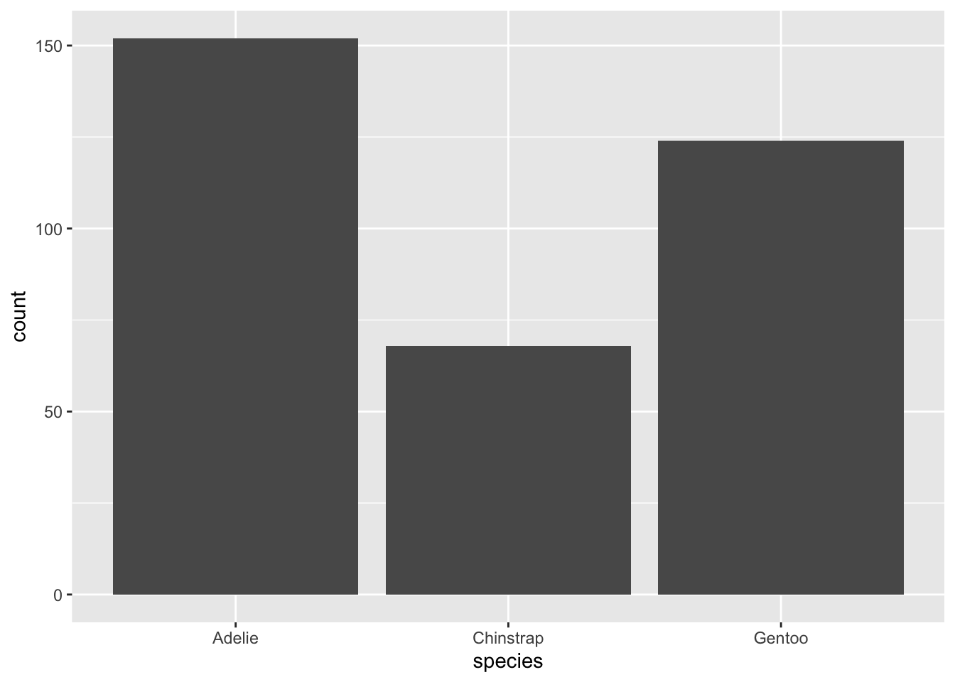
geom_bar: This bar plot geometry is well suited when you want to count up the observations of one categorical variable. By default, it takes only one mapping argument, x, and then calculates the counts based on the grouping of x.
geom_boxplot: This box plot geometry is well suited when you want to show the distribution of a continuous variable based on categorical groupings. Just like geom_point, geom_boxplot takes a x and a y argument, but one should be continuous and one should be categorical.
## Warning: Removed 2 rows containing non-finite outside the scale range
## (`stat_boxplot()`).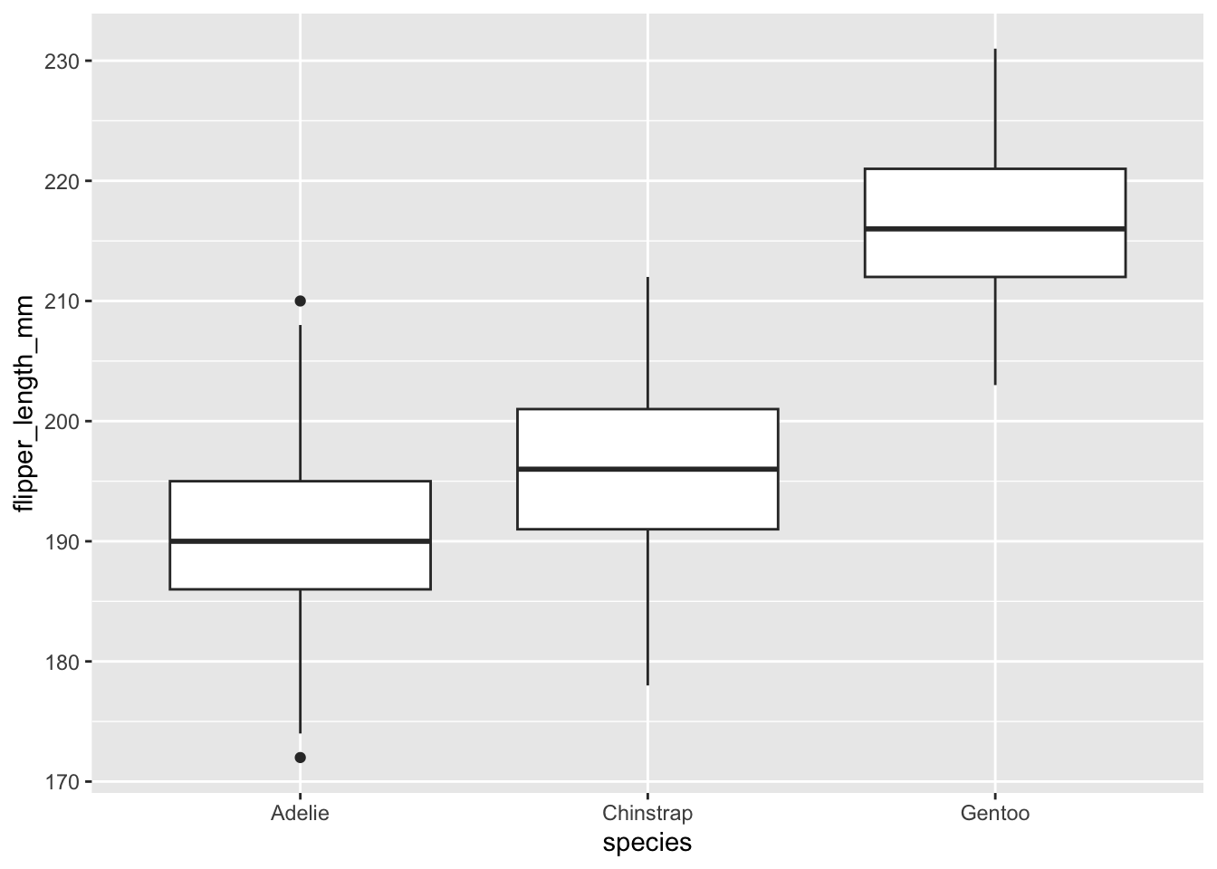
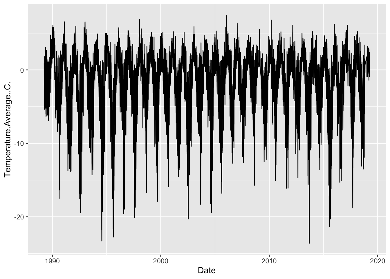
geom_line: This line geometry is well suited when you want to show how a continuous variable changes over time, where time is a bit of a mix between a continuous and categorical variable.
5.3.1 Combining wrangling & visualization
Let’s practice plotting using the weather data, and let’s think about our Date column as a categorical variable, with each year being a category. This will be a bit tricky, however, because the year variable is currently classified as a numeric data type, which means ggplot will want to treat it as continuous.
## [1] "numeric"Because of this, ggplot gets a bit confused…
## Warning: Continuous x aesthetic
## ℹ did you forget `aes(group = ...)`?
## Warning: Removed 11 rows containing non-finite outside the scale range
## (`stat_boxplot()`).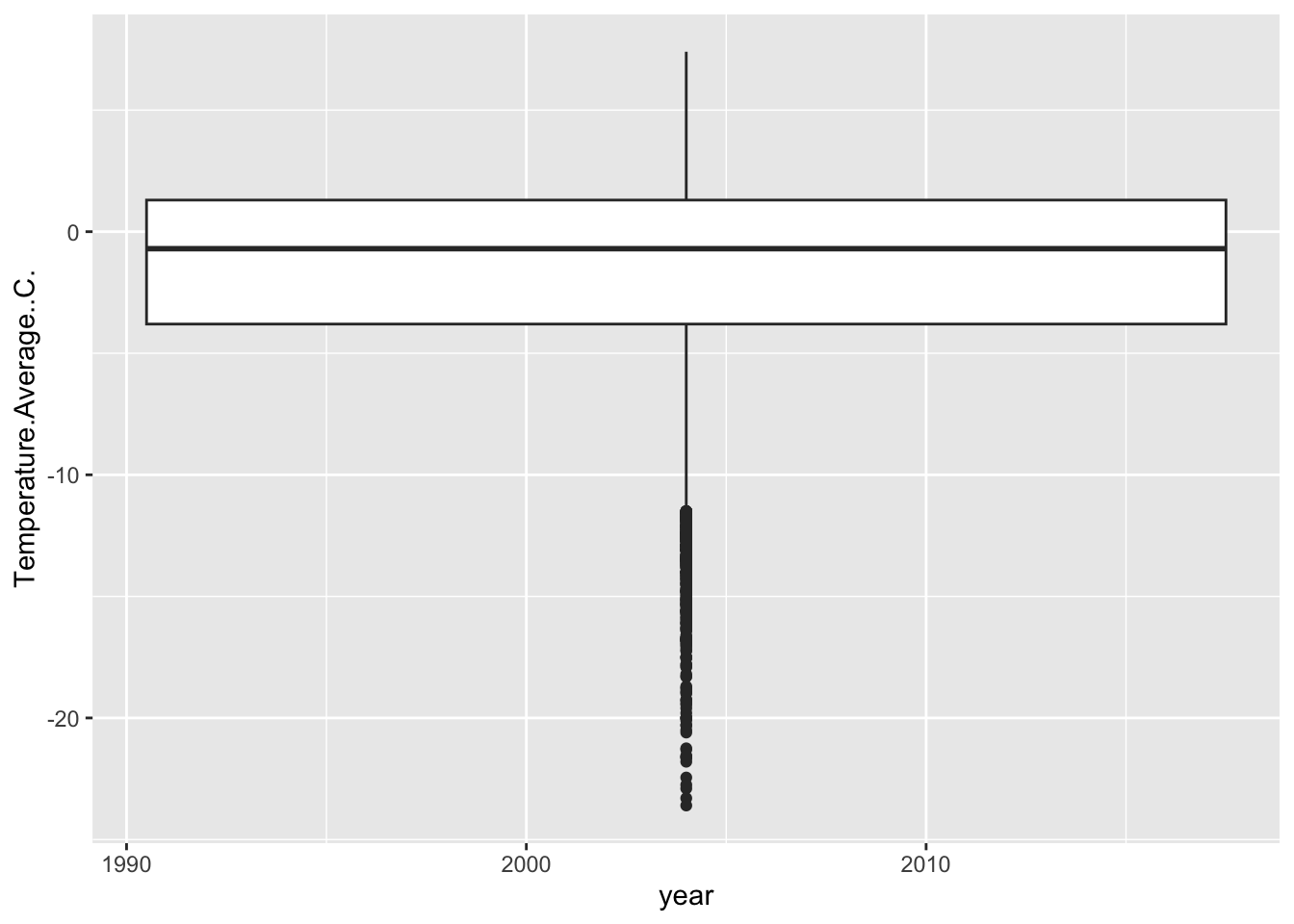
So, there are two ways we can prompt ggplot to think of year as a category. One way is to coerce our year variable into a ‘factor’, which tells R that these numbers are actually categories.
## Warning: Removed 11 rows containing non-finite outside the scale range
## (`stat_boxplot()`).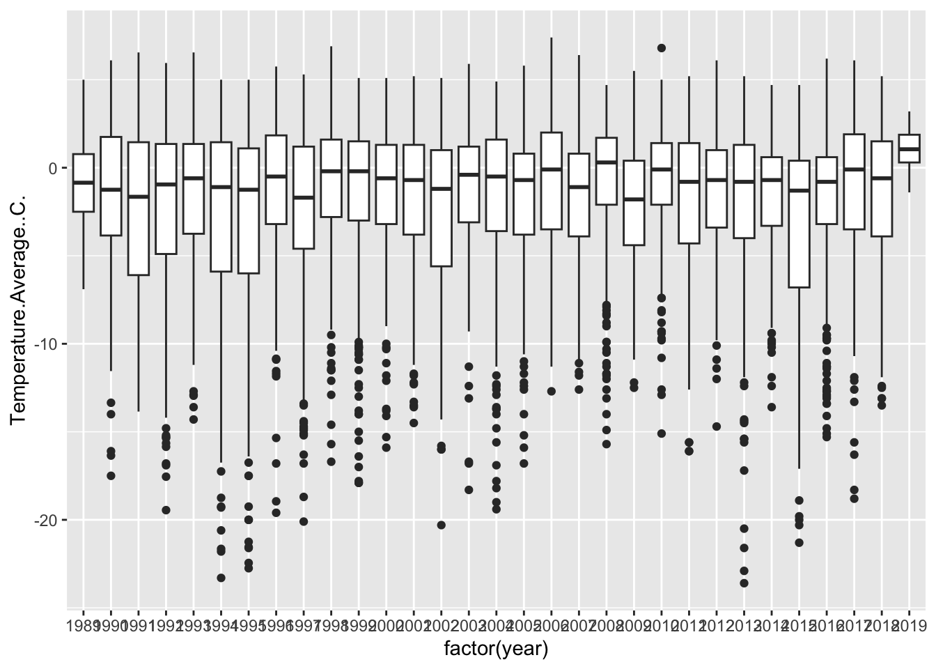
Another way is to assign are group aesthetic.
## Warning: Removed 11 rows containing non-finite outside the scale range
## (`stat_boxplot()`).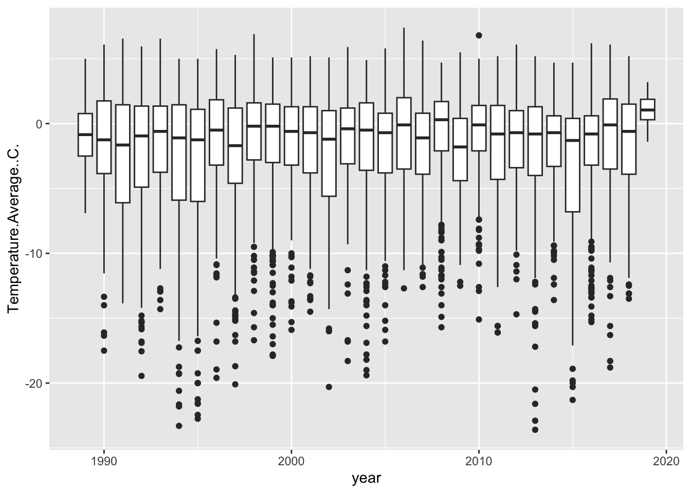
Now, remember the importance of using visualization to explore data. Does anything look off?
It jumps out to me that our first and last years are shaped different than the others. They have no low-temperature outliers and their distributions are much smaller. Let’s use our wrangling skills to investigate.
Take a look at a summary of the lowest (min) year:
## Date
## Min. :1989-04-01
## 1st Qu.:1989-06-08
## Median :1989-08-16
## Mean :1989-08-16
## 3rd Qu.:1989-10-23
## Max. :1989-12-31It only starts in April, so we are missing some data for that year. What about the final year:
## Date
## Min. :2019-01-01
## 1st Qu.:2019-01-16
## Median :2019-02-14
## Mean :2019-02-14
## 3rd Qu.:2019-03-15
## Max. :2019-03-31In ends in March, so we’re also missing data for that year. So let’s filter those out and pipe that filtered data frame directly into our ggplot:
weather %>%
filter(year != min(year) & year != max(year)) %>%
ggplot(aes(x = year, y = Temperature.Average..C., group = year)) +
geom_boxplot() ## Warning: Removed 11 rows containing non-finite outside the scale range
## (`stat_boxplot()`).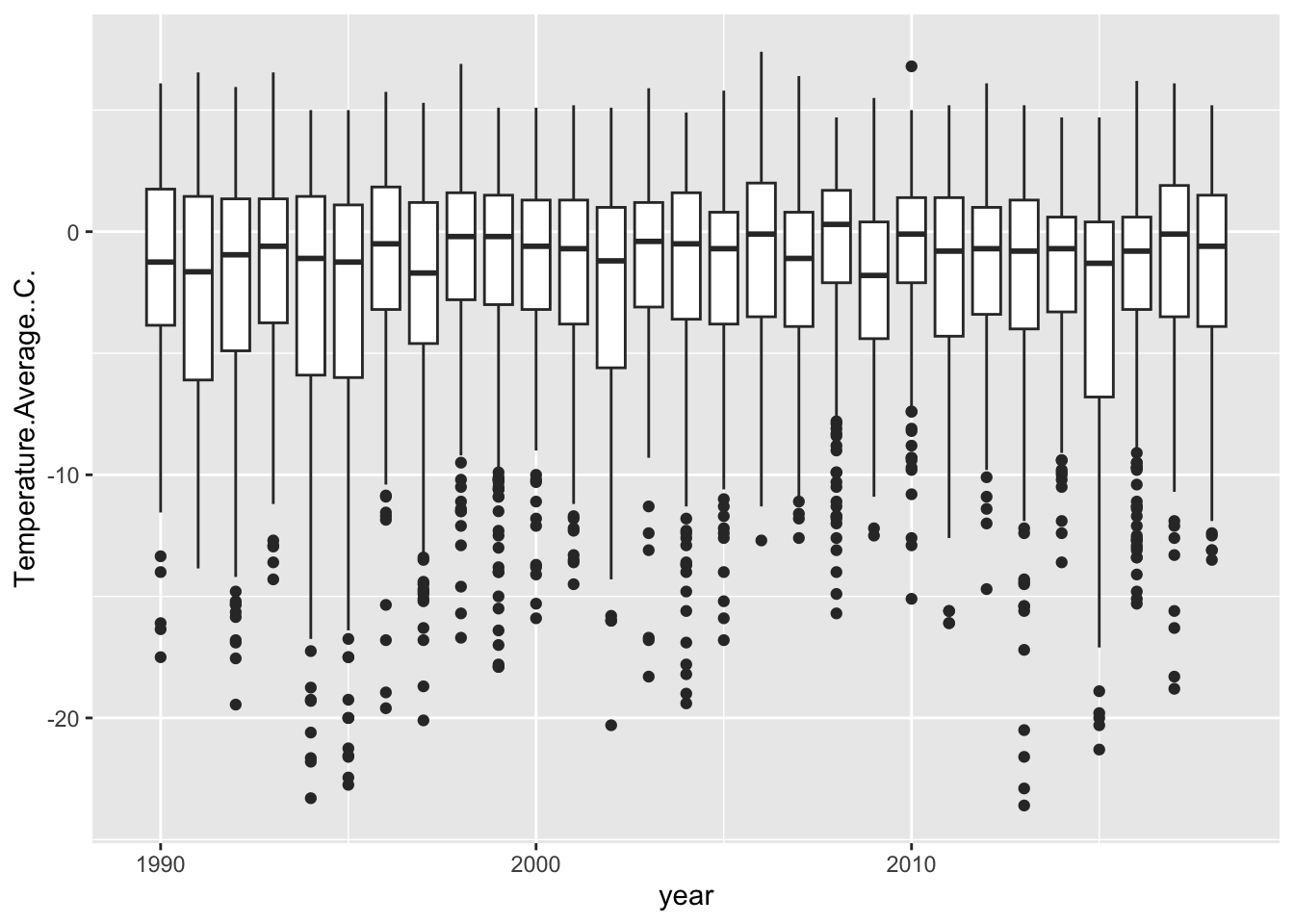
5.3.2 Check in challenge
Let’s practice combining data wrangling with plotting. First, use the case_when function to mutate a new column called ‘penguin_data_year’. The condition we’d like to set is to identify the years for which we have data in the ‘penguins’ data (2007:2009) as TRUE, and all of the other years FALSE. Second, re-create the yearly temperature box plot we just made, but add a color aesthetic using the ‘penguin_year_data’ to define the color. The end result should be the box plot, but with the distributions of 2007-2009 a different color from the rest. You can do this is two steps, or bonus if you pipe it all together.
Check your answer
weather <- weather %>%
mutate(penguin_data_year = case_when(
year %in% 2007:2009 ~ T,
T ~ F
) )
weather %>%
filter(year != min(year) & year != max(year)) %>%
ggplot(aes(x = year, y = Temperature.Average..C., group = year,
color = penguin_data_year)) +
geom_boxplot() ## Warning: Removed 11 rows containing non-finite outside the scale range
## (`stat_boxplot()`).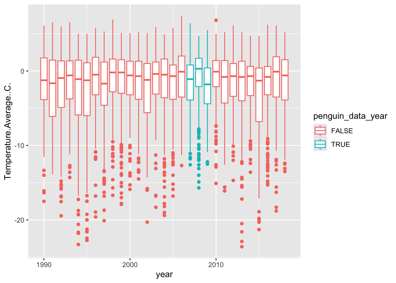
5.4 Styling
For this last section, we are going to add some additional stylistic features to our plots that make them more presentable. Because ggplot works in layers, you can actually save a version of the plot as a object, and then use that to layer on different features without re-typing everything. So let’s do that.
base_plot <- weather %>%
filter(year != min(year) & year != max(year)) %>%
ggplot(aes(x = year, y = Temperature.Average..C., group = year,
color = penguin_data_year)) +
geom_boxplot() Now we can add layers to that object. One of the first things we might want to do is set colors using pre-set palettes. We can adjust all of the mappings, such as color, using functions that start with scale_<MAPPING>_. One great set of palettes are linked to the viridis package, which makes colorblind friendly gradients, and ggplot includes the following functionality:
## Warning: Removed 11 rows containing non-finite outside the scale range
## (`stat_boxplot()`).
Here we choose _d because we want a palette for a discrete (d) variable, not continuous (c).
We can also set colors manually with scale_color_manual, where we provide a vector of colors to the values argument.
## Warning: Removed 11 rows containing non-finite outside the scale range
## (`stat_boxplot()`).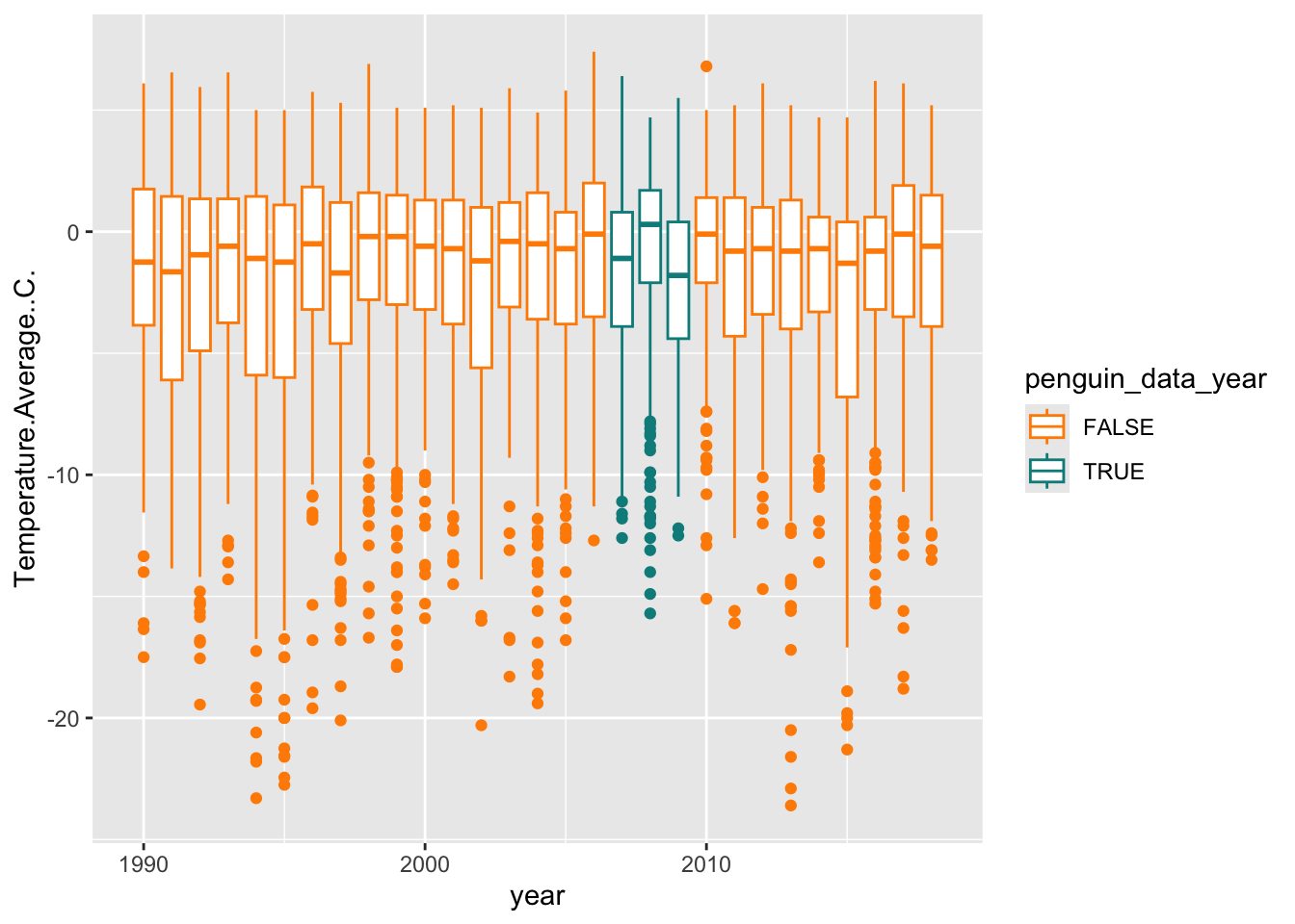
We can also add labels for all of the mappings with the labs function.
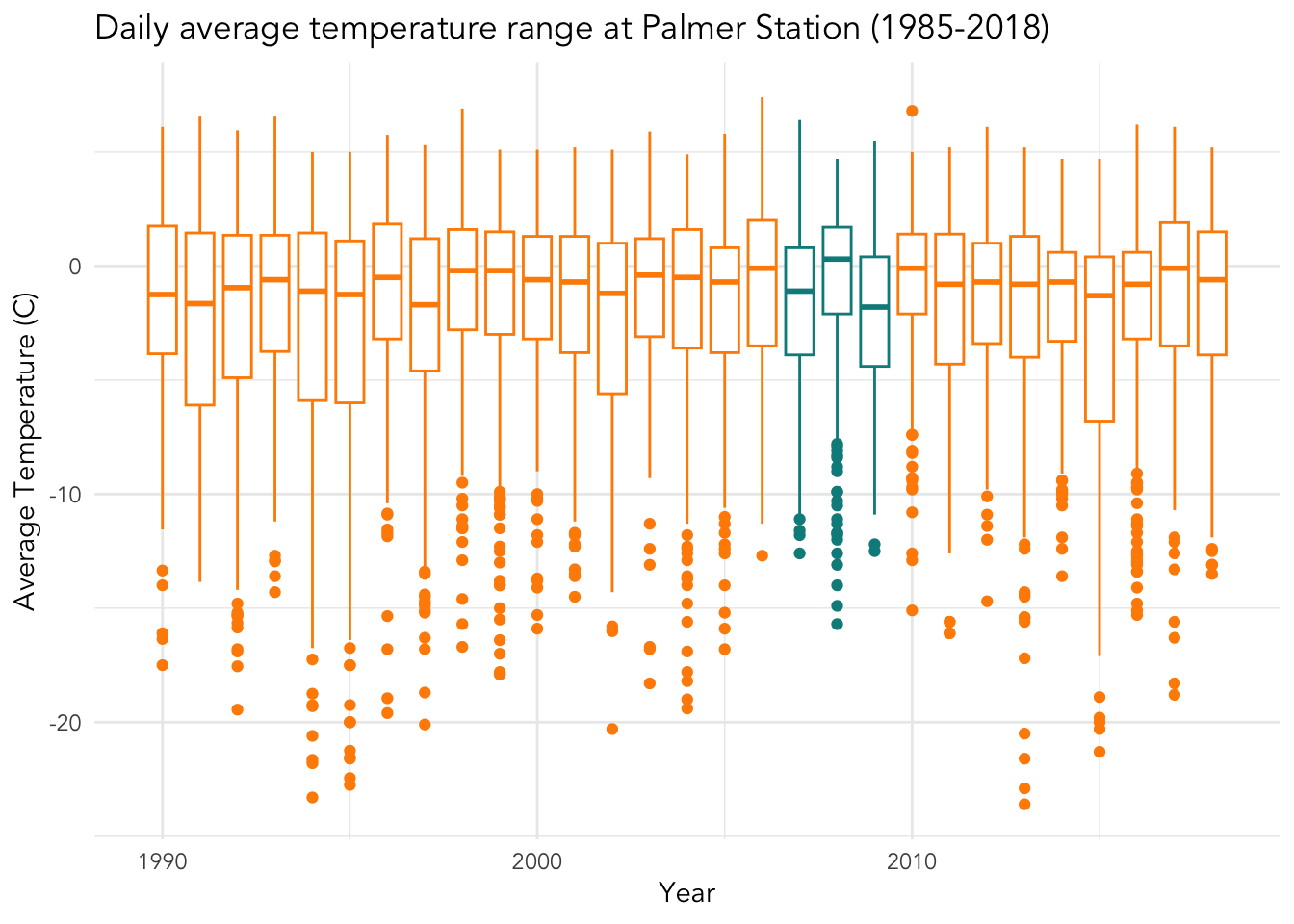
base_plot +
labs(x = "Year", y = "Average Temperature (C)",
title = "Daily average temperature range at Palmer Station (1985-2018)",
color = "Penguin data")## Warning: Removed 11 rows containing non-finite outside the scale range
## (`stat_boxplot()`).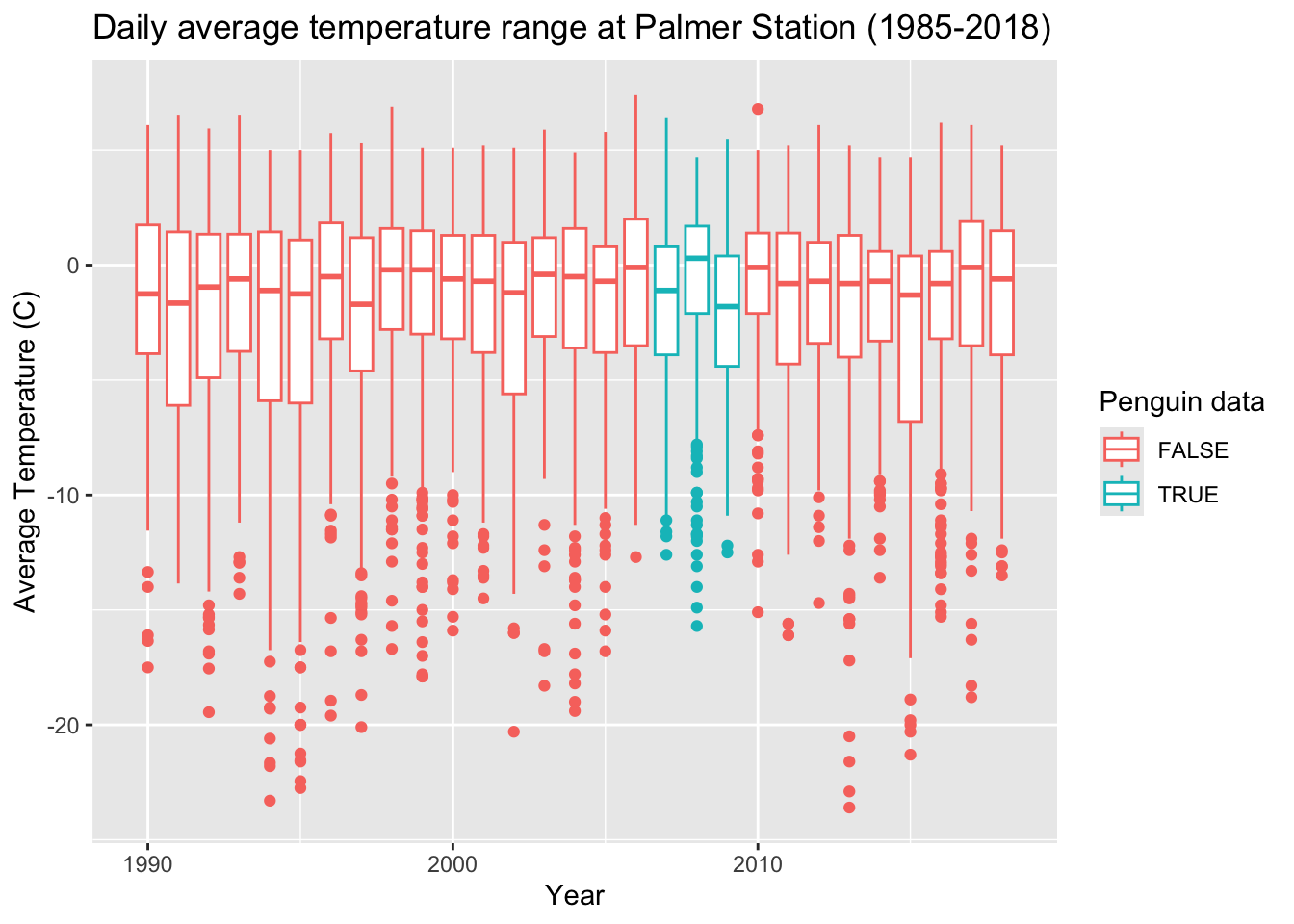
Next, theme_ can add an overall nice touch to adjust the overall look of plot (e.g. background, axis lines). I like theme_minimal but there are all kinds of themes. Try tab completing after you type the following
theme_Let’s apply one:
## Warning: Removed 11 rows containing non-finite outside the scale range
## (`stat_boxplot()`).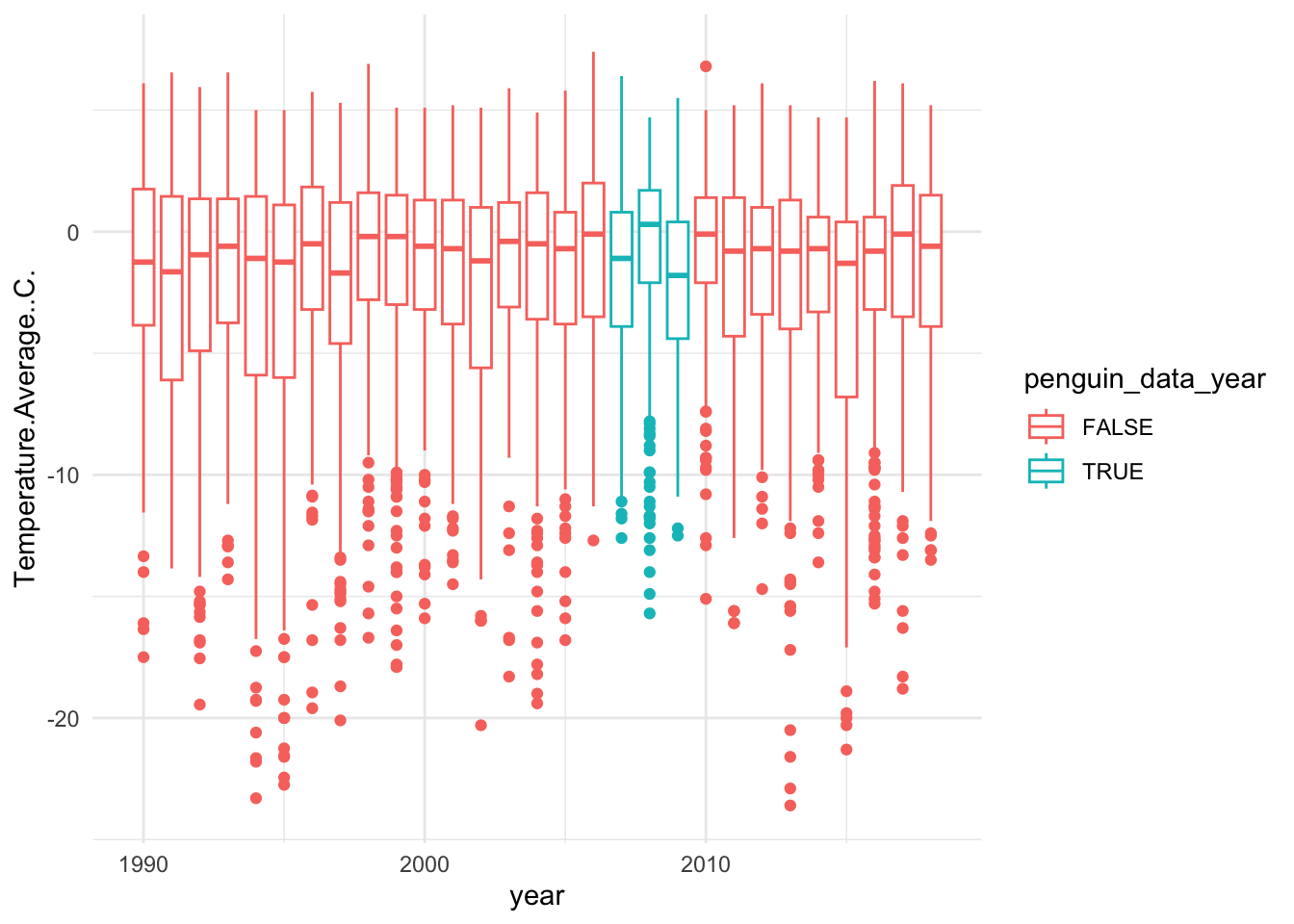
You can also further customize the theme with a stand-alone theme function. Here we can add customization like removing the legend.
## Warning: Removed 11 rows containing non-finite outside the scale range
## (`stat_boxplot()`).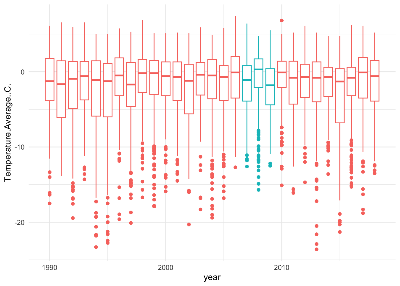
Also within theme you can change the text (and much more!)
base_plot +
theme_minimal() +
theme(legend.position = "none",
text = element_text(family = "Avenir"))## Warning: Removed 11 rows containing non-finite outside the scale range
## (`stat_boxplot()`).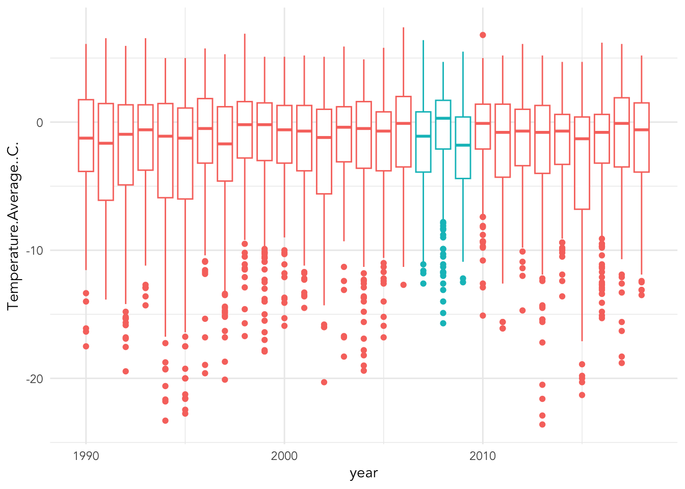
Now, let’s put it all together
base_plot +
scale_color_manual(values = c("darkorange","cyan4")) +
labs(x = "Year", y = "Average Temperature (C)",
title = "Daily average temperature range at Palmer Station (1985-2018)",
color = "Penguin data") +
theme_minimal() +
theme(legend.position = "none",
text = element_text(family = "Avenir"))## Warning: Removed 11 rows containing non-finite outside the scale range
## (`stat_boxplot()`).